 |
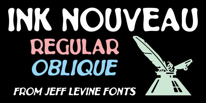
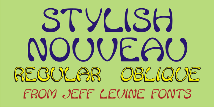
Ink Nouveau JNL is loosely based on the hand lettered title from a lobby card for the 1927 film “The Taxi Dancer” and is available in both regular and oblique versions.
The design emulates a hastily or sloppily drawn Art Nouveau display font.
 |
Ink Nouveau JNL is loosely based on the hand lettered title from a lobby card for the 1927 film “The Taxi Dancer” and is available in both regular and oblique versions.
The design emulates a hastily or sloppily drawn Art Nouveau display font.
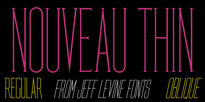 |
A condensed, light face spurred serif alphabet was shown on an antique catalog page from Spon & Chamberlain Publishers as “French”. The catalog likely sold tools and dies to stonecutters for making inscriptions in marble, granite and so forth.
This elegant design is available digitally as Nouveau Thin JNL in both regular and oblique versions.
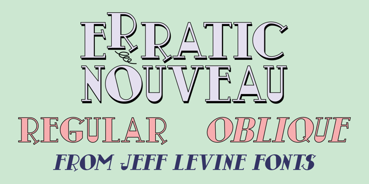 |
The title on the 1925 sheet music for “By the Light of the Stars” was hand lettered in an eccentric Art Nouveau type style with varying character shapes and line widths.
This is now available as Erratic Nouveau JNL in both regular and oblique versions.
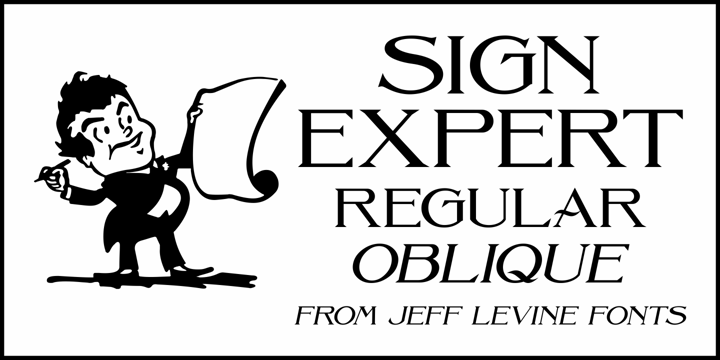 |
An elegant, yet informal Roman alphabet with Art Nouveau influences was found amidst the pages of the 1922 edition of “The Expert Sign Painter”.
It is now available digitally as Sign Expert JNL in both regular and oblique versions.
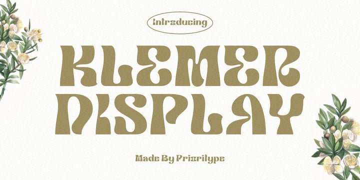 |
Klemer Display
A typeface inspired by the psychedelic effect and simplified even more. Great for poster designs, logos, t-shirt designs or vintage and modern design themes.
Thanks :)
 |
There is no doubt that the 1941 version of “The Maltese Falcon” was superior to the prior two attempts by Warner Brothers at filming Dashiell Hammett’s 1930 novel.
Sam Spade was perfectly portrayed by Humphrey Bogart, and the supporting cast of Mary Astor, Peter Lorre, Sidney Greenstreet and Elisha Cook, Jr. rounded out the main players in a great suspense film that is considered to be the first (if not one of the first) of the film noir genre.
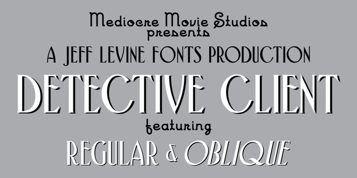
The title cards for the production and cast credits were hand-lettered in a spurred serif type style strongly reminiscent of the Art Nouveau period, so instead of naming the digital version with some “tough guy detective” moniker, it was decided that Detective Client JNL was more appropriate.
After all, this is a reasonably attractive font, and in this kind of film it’s usually the “attractive damsel in distress” [be she the victim or the actual perpetrator] that gets the story rolling…
Detective Client JNL is available in both regular and oblique versions.
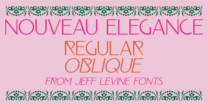 |
The gently spurred serif hand lettering found on an advertisement for Berkshire Stockings (circa the 1920s) was the inspiration for Nouveau Elegance JNL, which is available in both regular and oblique versions.
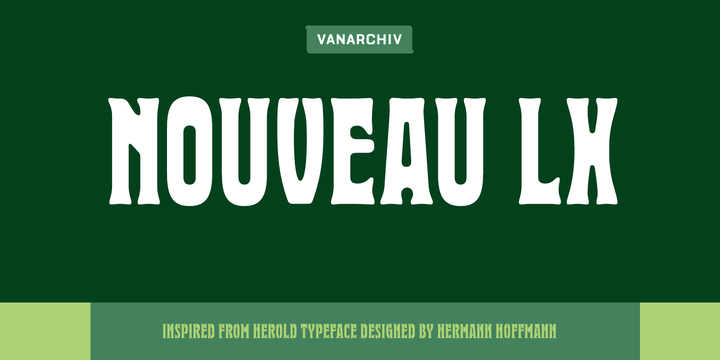 |
The original design came from Berthold Herold typeface, designed by Hermann Hoffmann during 1913 (Art Nouveau style) in Germany. This project started from flyer printed during 1947 with movable type, the specimen was scanned as a source to development some of the uppercase letterforms. However the most unusual and tricky element from this sample is the leg from the uppercase (R) which is different from the original Herold design, until now I didn’t found where this version originally came from. This font family only contain the bold weight, but there are also a stencil and expanded versions available.
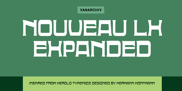
The original design came from Berthold Herold typeface, designed by Hermann Hoffmann during 1913 (Art Nouveau style) in Germany. This project started from flyer printed during 1947 with movable type, the specimen was scanned as a source to development some of the uppercase letterforms. However the most unusual and tricky element from this sample is the leg from the uppercase (R) which is different from the original Herold design, until now I didn’t found where this version originally came from. This expanded version only contain the bold weight, however there are also stencil (Nouveau LX Stencil) and condensed version (Nouveau LX) available.
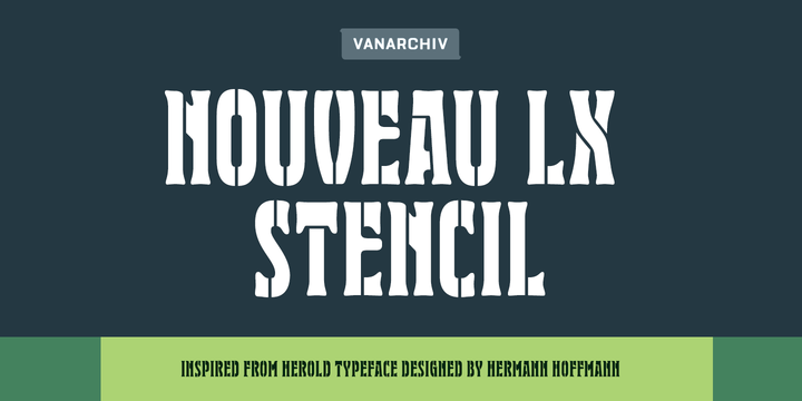 |
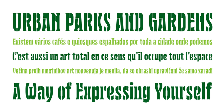
The original design came from Berthold Herold typeface, designed by Hermann Hoffmann during 1913 (Art Nouveau style) in Germany. This project started from flyer printed during 1947 with movable type, the specimen was scanned as a source to development some of the uppercase letterforms. However the most unusual and tricky element from this sample is the leg from the uppercase (R) which is different from the original Herold design, until now I didn’t found where this version originally came from. This stencil typeface only contain the bold weight, but there are also available other versions without stencil cuts, like Nouveau LX and Nouveau LX Expanded.
 |
| Download Nouveau LX Stencil Fonts Family From Vanarchiv |
 |
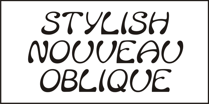 |
| Download Stylish Nouveau JNL Fonts Family From Jeff Levine |
 |
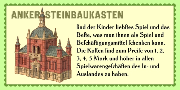
Rekord Antiqua, regular and semibold, released 1911 by Wagner & Schmidt, is a perfect body text partner for Art Nouveau display fonts. Both styles come with a long s, which can be reached by the OT feature of historical forms or by typing [alt] + b.
In addition, you find two framing elements on [alt] + P and [alt] + p.
 |
| Download Rekord Antiqua Fonts Family From RMU |
 |
 |
 |
 |
 |
 |
©
Inessa Izmailova
2014 . Powered by
Blogger
Blogger Templates
.
.